Don’t Get Fooled: 3 Red Flags to Look for on Prompt Comparison Charts

A comparison chart is one of the most effective tools in a vendor’s marketing arsenal — and one of the least reliable tools available to a buyer making a real decision. The reason is structural: the vendor who builds the chart also selects the criteria, fills in their own row, and frames every dimension to favour their product. The result looks like an objective evaluation. It isn’t.
For entrepreneurs evaluating AI prompt products, the expert ai prompts comparison chart format is everywhere. And the ability to read these charts critically — to distinguish a genuine evaluation tool from a sales page with table formatting — is the difference between a confident purchase decision and an expensive mistake.
Three specific red flags reveal the difference. Spotting them takes less than two minutes.
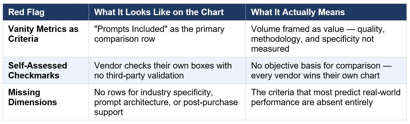
Red Flag #1: Vanity Metrics as Comparison Criteria
The most common manipulation tactic on vendor-built comparison charts is to select criteria that measure volume or access rather than value or performance. “Number of prompts included” is the classic example. It’s a real number, it’s easy to compare, and it communicates nothing about whether any of those prompts will produce professional-quality outputs for your specific business context.
Other common vanity rows include “price per prompt,” “unlimited use,” “instant download,” and “works with any AI tool.” These are table-stakes features — the minimum expected from any prompt product — framed as differentiators. When a comparison chart is built primarily around these dimensions, the vendor has told you something important: they can’t compete on the criteria that actually predict performance.
The dimensions that should be on any honest expert ai prompts comparison chart are the ones that predict real-world output quality: industry specificity (are prompts built for your deliverable types, or are they generic?), prompt engineering methodology (is there a documented architecture behind the prompts, or are they ad-hoc?), output quality evidence (are sample outputs or case study results visible?), and post-purchase support (is there onboarding, training, and ongoing resources, or just a download?). If these dimensions are absent, the chart was built to win, not to inform.
Red Flag #2: Self-Assessed Checkmarks With No Validation
The second red flag is the most structurally obvious — and the most frequently overlooked because comparison charts have trained buyers to accept checkmarks as evidence. They aren’t. A checkmark placed by a vendor in their own product row is a self-assessment, not a validated claim. It means the vendor believes, or wants you to believe, that they offer that feature. It is not evidence that they do, or that it works.
Validated comparisons look different. They include third-party testing results, sample outputs that demonstrate the claimed quality, documented user results with specific metrics, or verifiable free trial access that lets you test the claims against your own real work before any purchase commitment. The absence of any of these — the presence of only self-assessed checkmarks and marketing language — is itself the signal.
The 60-second test: find one specific quality claim on the chart and ask the vendor for evidence. A sample output. A case study. A before/after comparison. If the answer is more marketing language, the chart is a sales device. If the answer is a link to documented results or a free trial that lets you verify it yourself, you’re looking at a vendor who has built confidence into their evaluation process rather than around it.
Red Flag #3: Missing Dimensions That Predict Real-World Performance
The third red flag is subtler than the first two because it’s defined by absence rather than presence. The criteria most predictive of how a prompt pack will actually perform in a real business context are almost never included on vendor-built comparison charts — because they require genuinely superior products to win, and generic products cannot compete on them.
These missing dimensions include: prompt architecture (does each prompt encode role, task, audience, tone, context, and output format — or is it a one-line command?), brand voice adaptability (can the prompts be tuned to produce on-brand outputs, or do all outputs sound the same regardless of client?), industry-specific deliverable coverage (does the product name the actual deliverables your business produces, or does it rely on “works for any industry” language?), and onboarding path (is there a structured implementation guide that helps you operationalize the prompts across your workflow, or does the product end at download?).
When these dimensions are absent, add them yourself. Three questions reveal everything: Does this product name my specific deliverable types? Can you show me a sample output? What happens after I download? A vendor whose product genuinely performs at an expert level can answer all three immediately. A vendor whose product cannot compete on these dimensions will redirect, generalize, or not respond.
How to Use a Comparison Chart Correctly
Treat every vendor-built comparison chart as a starting point, not a conclusion. Read it to understand what the vendor believes their strengths are — then add the rows they left out. What specific deliverables do you need to produce? Which product names them explicitly in its product description, not in a vague feature row? Which vendor provides sample outputs? Which offers a free trial that tests prompts against your actual work?
The chart below applies the three-red-flag framework to the most common comparison dimensions in the AI prompts market:
The pattern is consistent: the criteria that most predict real-world performance are the criteria that vendor-built charts consistently omit.
Read the Chart. Then Read Past It.
A comparison chart that passes the three-red-flag test — no vanity metrics, no unvalidated checkmarks, no missing performance dimensions — is a genuine evaluation tool. One that fails any of them is a sales page formatted as a table. The formatting looks the same. The underlying intent doesn’t.
The Expert AI Prompts comparison chart is built on the dimensions that predict performance: 50 industry-specific prompts engineered on the 7-part High-Performance Prompt Framework, with documented ROI results, free trial access to test before purchase, and a full post-purchase onboarding path. It passes all three tests because it was built to survive them.
See the full prompt pack lineup and apply the vetting framework yourself:
https://expertaiprompts.com/prompt-packs